Responsive design workshop
The objectives of this workshop:
• improve the HTML integration with Flex and Grid properties.
• make the whole thing responsive.
Initialisation
This workshop is the second part of the HTML Basics workshop. So you can start from your previous work or download this version if you are not sure of what you did.
Layout of your website
You will have to create a basic responsive website following the layout below (do not try to be pixel perfect, this image is just a guide).
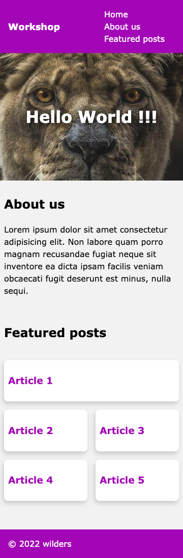
(The screenshot has been made at 360px viewport width, it is a standard smartphone size).
Navbar
- Now for this mobile version, the HTML structure of the navigation bar has not changed but its presentation is different. Reproduce this using flexbox.
Reminder:
Video - Flexbox in 100s
Flexbox basics Cheatsheet
Header
- The
<header>section could be improved too by using flexbox to center horizontally but also vertically the<h1>.
Featured posts section
Unlike the About Us section which doesn’t need to be modified here, the Featured posts section requires you to add a css class to it.
- Add the
featured-postsCSS class to this section. - Add a fifth article in the HTML structure.
- Using CSS grid, create a 2 columns layout. According to the template, the first article will take 2 cells in the grid, others only one.
Reminder: CSS Grid basics in 5 minutes.
Tips: the first article can be targeted with the
:first-of-typecss selector.
Make it responsive
Add media queries and use CSS functions to obtain the responsive layout below at 1200px.
You can use a breakpoint at 768px in your media queries (which is a landscape breakpoint of some tablets).
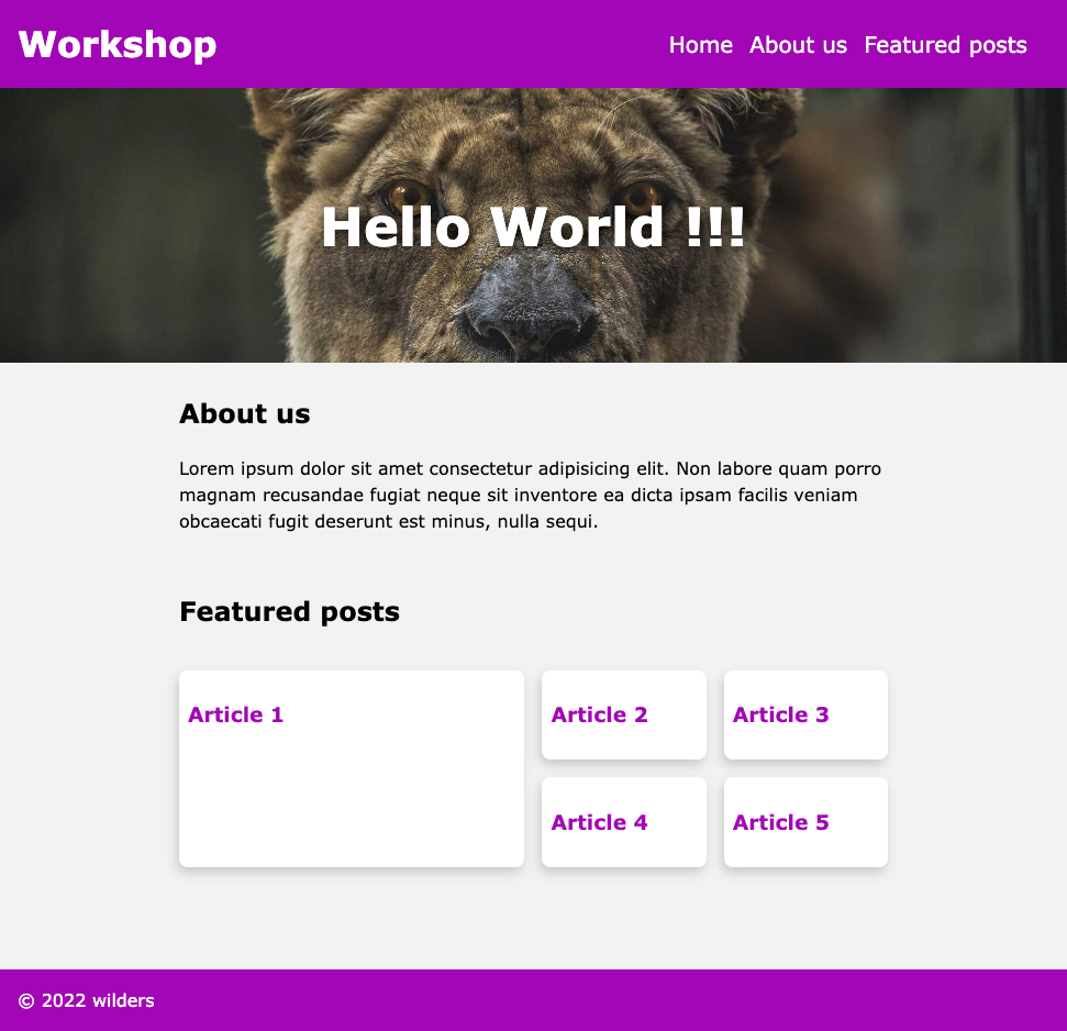
(The screenshot has been made at 970px viewport width.)
- Make the navbar responsive.
- Use
clamp()function to make your<h1>readable for each size. - Modify the Grid template to adapt the products horizontally over 4 columns layout but still keep a largest “Article 1” over 2 columns and 2 rows.
Tips: add this code snippet to your css so that the
<h2>is positioned in a friendly way 😏 .section.featured-posts h2 { grid-column: 1 / -1; }
- Add a
filter: drop-shadowpropertie on the<h1>of the<header>but only for screen media to make sure this effect is excluded from printers context.